There is no doubt that there are cues that unconsciously guide people’s choices, desires and feelings, influencing their decisions, and color is the best example. It goes directly from the eyes to the brain and heart, thereby controlling a person’s emotions and psychological state, and in turn, his decisions. Scientists use this fact to enhance the efficacy of drugs by choosing their colors, and business owners also use this color effect when choosing storefronts, logos and signs.
What is the relationship between color psychology and commercial painting?
Sama Signs Manufacturing Company firmly believes that color plays an important role in highlighting the brand image and attracting customers. We are also keen on choosing colors that match each other to ensure a striking and elegant appearance. In the implementation of our commercial signs, we rely on rich, high-definition colors that are resistant to fading and changing environmental conditions. It is our responsibility to educate the client during the construction process about the role of color, its meaning, and its harmony with other colors. Design, so that he can get the maximum benefit from the services we provide to him.
Some of the colors that are generally considered suitable for store signage, and the meanings these colors may carry:
1. Red:
Meaning: Power, excitement, enthusiasm.
Uses: Red is a very eye-catching color that quickly attracts attention, so it is often used in stores that rely on quick offers or hope to attract a crowd, such as restaurants or discount stores.
Compatible with: White, Black, Yellow.
2. Yellow:
Meanings: Optimism, new opportunities, happiness, and openness.
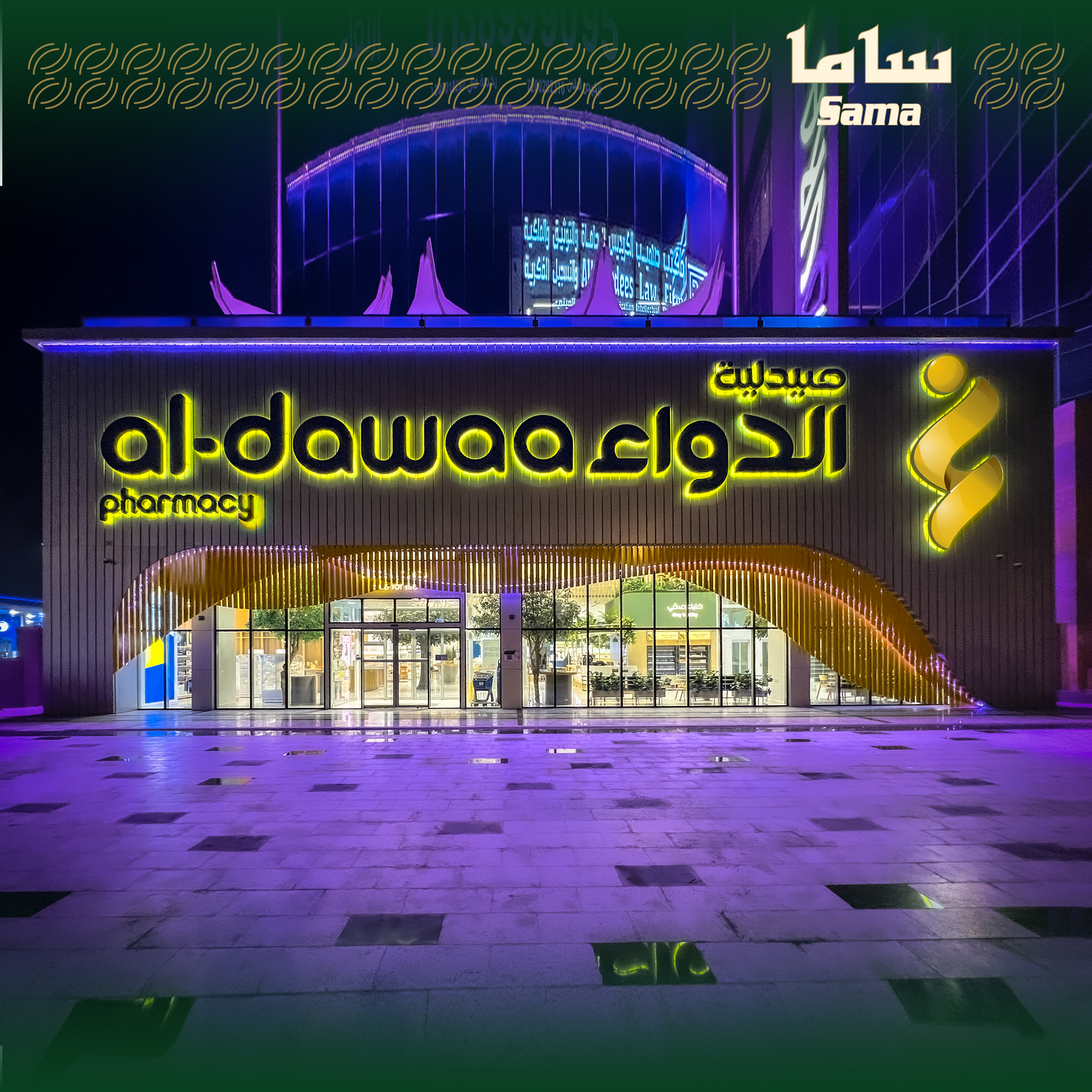
Uses: Yellow gives people a welcoming feeling and is often used in stores that want to invite visitors in. Suitable for drug stores, grocery stores, toys and children’s stores.
Compatible with: Black, Red, Blue.
3. Blue:
Meanings: Trust, security, and professionalism.
Uses: Blue gives people a sense of reliability and trustworthiness, so it is often used in financial institutions, travel agencies, stations, etc. Enhance self-confidence and comfort.
Compatible with: White, Gray, Yellow.
4. Green:
Meanings: Nature, growth, and health.
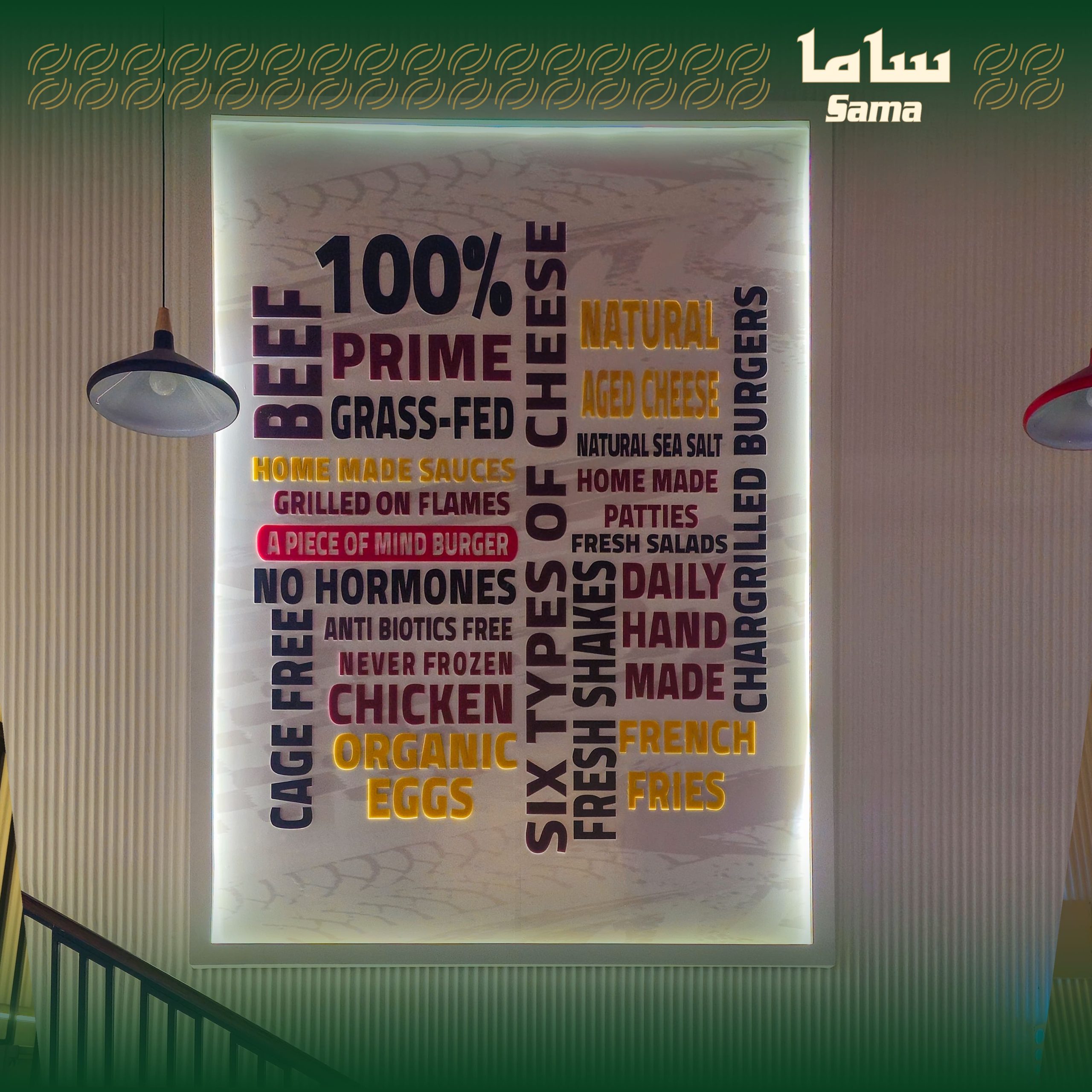
Uses: Green is associated with health and sustainability, and is perfect for eco-friendly stores or stores that sell natural or organic products, such as health food stores and flower shops.
Compatible with: White, Yellow.
5. Black:
Meanings: Luxury, elegance, mystery.
Uses: Black is often used in luxury fashion stores or high-end products, giving a sense of elegance and luxury.
Compatible with: gold, white, silver.
6. Orange:
Meaning: Lively, warm, cheerful.
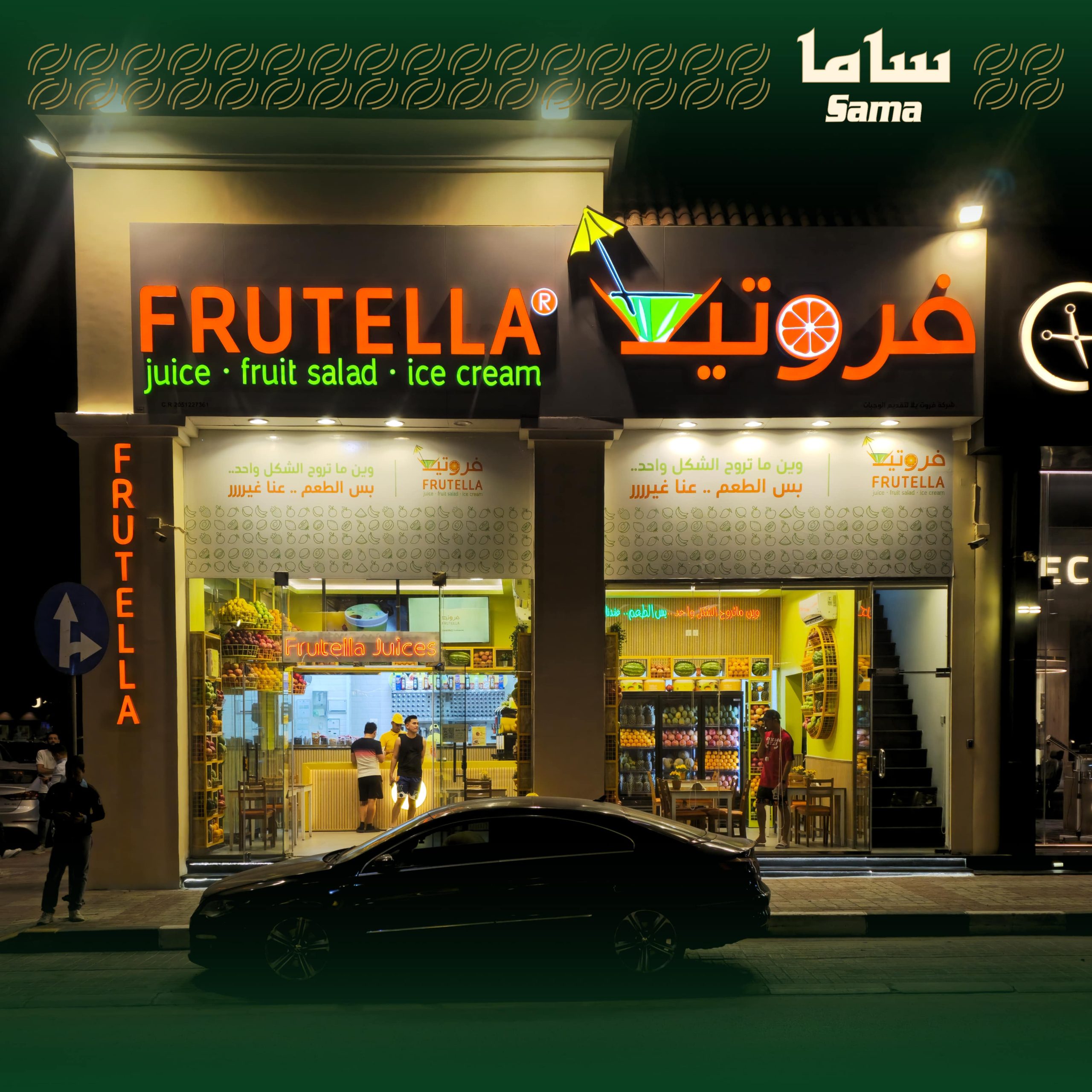
Uses: Orange is a warm and attractive color used in stores that want to highlight vitality and fun, such as sporting goods stores or youth product stores.
Compatible with: white, blue, black.
7. Purple:
Meaning: Luxury, creativity, mystery.
Uses: Purple symbolizes luxury and creativity and is used in jewelry stores or interior design stores. Enhances a sense of elegance and uniqueness.
Compatible with: white, gold, black.
8. White:
Meaning: Purity, simplicity, clarity.
Uses: White is a pure, clear color and is often used as a background for other colors. It can be used in stores that rely on a simple, modern look, such as technology stores or stores that focus on modern design.
Compatible with: black, blue, red.
9. Gold:
Meaning: Luxury, wealth, splendor.
Uses: Gold is ideal for creating a sense of luxury and opulence and is often used in jewelry or luxury stores. When paired with black or purple, gold creates a bright and unique look.
Compatible with: Black, White, Purple.
We at Sama Sign Manufacturing recommend considering the following when choosing colors:
Visual identity of the brand: Colors should be consistent with the logo and store identity.
Clarity: Colors should be clear and readable from a distance, especially for outdoor signs.
Color compatibility: Colors should be chosen to coordinate with each other to ensure aesthetics.


